
Services
Desktop Design and Branding
Category
Car Rental Desktop
Client
UX Design Institute
Overview
Discover
| Understand the user needs, business goals, and market landscape.
In the Discover phase, we aimed to build a deep understanding of users, stakeholder goals, and the competitive landscape, specifically for the desktop web experience. The project specifically focused on creating the desktop journey, I combined qualitative and quantitative research methods to surface user pain points, validate assumptions, and find key opportunities to streamline the desktop rental journey.
Competitive Benchmarking
To kick off the project, I conducted a comparative analysis of four leading car rental websites: Sixt, Hertz, Enterprise and Thrifty. My goal was to understand best practices around booking flows, pricing visibility, and insurance upselling on desktop experiences.
Key Insights:
Sixt and Hertz provided sticky booking summaries, and had excellent user experience in regards to booking flow that allowed users to monitor processes and costs.
Enterprise used simplified search fields to create an intuitive flow, and direction for the user.
Thrifty clearly had pain points with their User interface, which creating an understand of what not to pursue.
Outcome: These insights helped us benchmark success and identify design opportunities to streamline our booking experience.
Online Surveys
I distributed an online survey to 10 individuals who had rented a vehicle online within the past six months. The survey focused on booking behaviours, frustrations, and decision drivers when choosing a rental company via desktop.
Key Findings:
30% of users prioritised price and budget
Users want more flexible pick-up/drop-off times and clearer insurance and vehicle information
Users evenly split between Kayak, Expedia, Enterprise, Hertz, and CarRental.com, suggesting users are not loyal to one platform.
Outcome: I validated that transparency and simplicity were critical design goals for our desktop flow, and an opportunity to grab loyalty with a positive user experience.
Usability Testing
I conducted remote usability testing with two participants using the existing car rental desktop website. The sessions were task-based, asking users to complete a vehicle booking with optional insurance add-ons.
Top Usability Issues Identified:
Users found the vehicle selection process elongated and difficult to navigate.
The checkout form was long, fragmented, and visually overwhelming.
Lack of visible progress indicators left users confused about how many steps remained.
Outcome: I pinpointed critical friction areas needing design intervention early in the project.


SwiftDrive
Car Rental for Desktop
"A UX case study focused on streamlining online vehicle bookings and improving checkout clarity."
Define
| Clarify the real problem based on research findings.
After gathering extensive research data, the Define phase focused on synthesising insights into clear, actionable problem statements. By clustering user feedback into themes, mapping the customer journey, and reworking user flows, we clarified the key barriers preventing users from completing bookings. This stage ensured we moved forward with a shared understanding of user needs, pain points, and business goals, laying a solid foundation for ideating targeted solutions.
Develop
| Explore creative solutions and start visualising them.
With a clear problem in mind, I moved into the ideation phase. Early-stage prototypes were tested to validate assumptions and gather feedback quickly. Iterative testing revealed user preferences for visual comparison tools, transparent insurance breakdowns, and a streamlined three-step checkout process. Based on user feedback, I refined our designs through multiple iterations, ensuring that each new version addressed previously identified usability issues while staying aligned with business goals.
Affinity Diagrams / Card Sorting
After synthesising data from surveys, usability testing, and stakeholder discussions, we created affinity diagrams to cluster similar feedback and observations into themes.
Key Themes:
Navigation and task flows were often unclear or overly complicated, leading to user friction and task abandonment.
Visual inconsistencies, such as poor contrast and cluttered layouts, negatively impacted the readability and usability of key interfaces.
Information architecture sometimes caused confusion due to unclear categorisation and grouping of content.
Interactive feedback was inconsistent, with delays or missing visual cues causing user uncertainty during actions.
A lack of clear trust signals and professional design elements reduced users' confidence in site reliability and security.
Outcome: These themes provided a clear focus for redesign priorities.
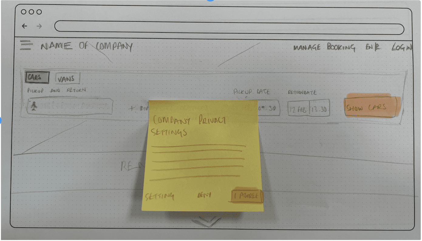
Design Sketching
Initial ideation through rapid low fidelity sketching (Crazy 8s) based on defined problems.
Ideas Explored:
Car cards with expandable details.
Sticky cost breakdown on right sidebar.
Simplified 3-step checkout flow.
Simple search fields selection process.
Expandable viewing.
Purpose to provide an initial understanding of ideation of prototyping, to provide initial first draft feedback.
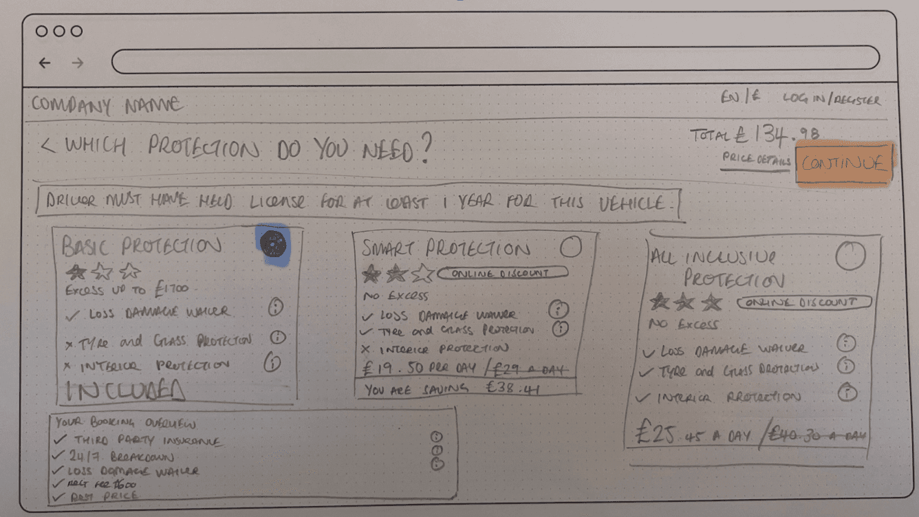
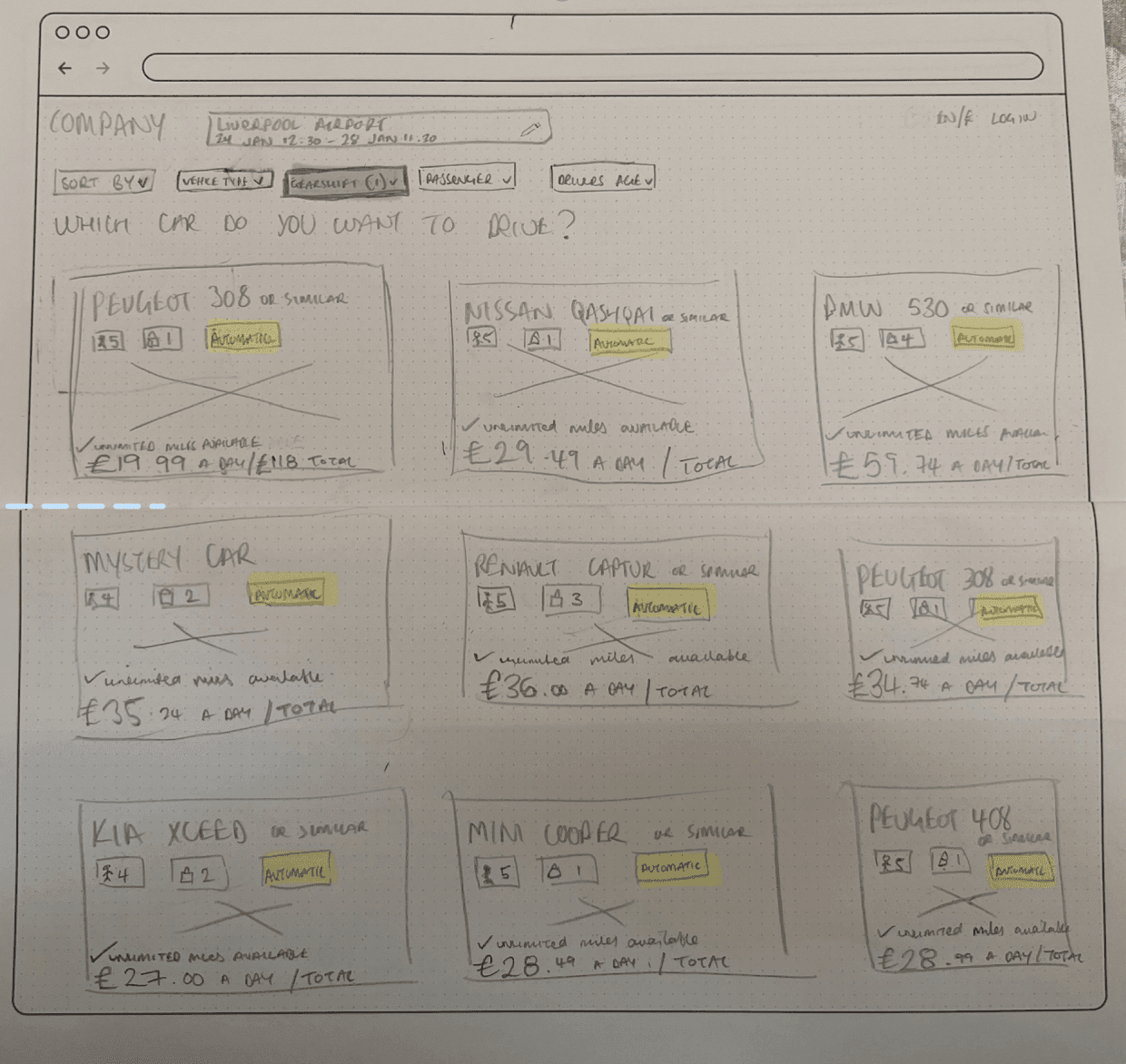
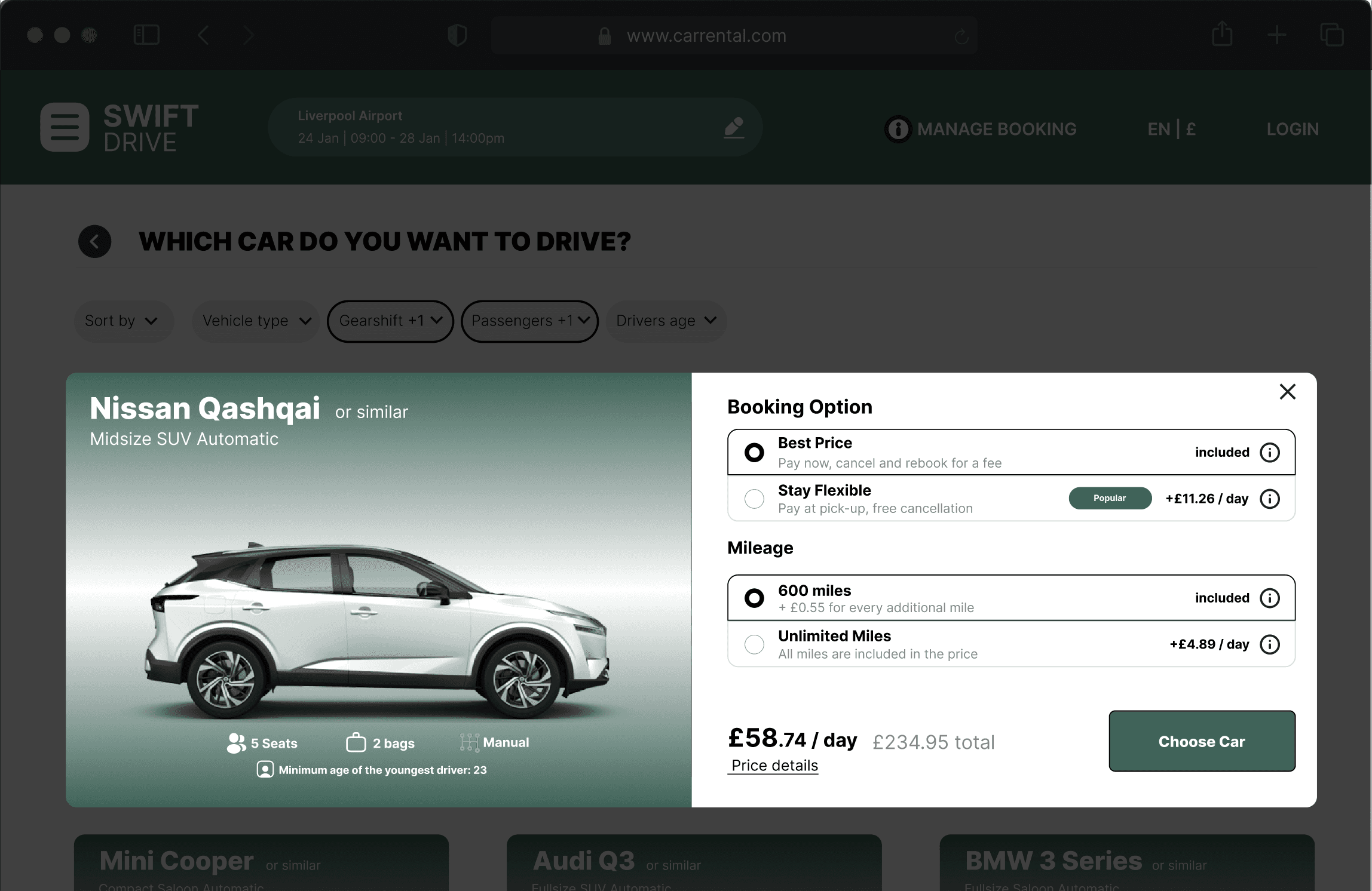
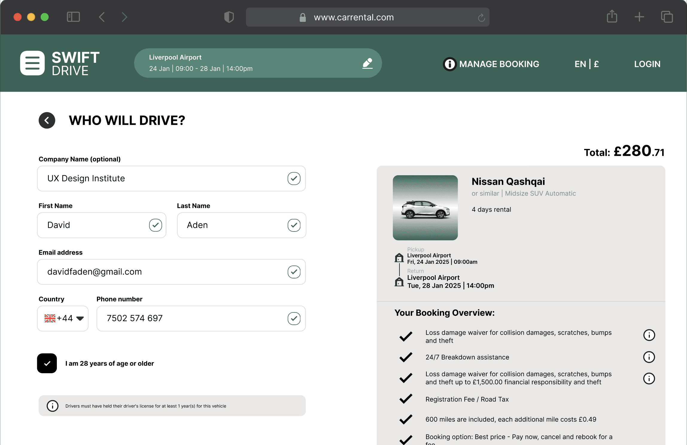
Wire-framing, Prototyping and UI Design
I moved into digital low and mid-fidelity prototyping based on sketches.
Details:
Focused first on desktop screen flows.
Prioritised hierarchy: Car details, cost clarity, call-to-actions.
Integrated feedback from early reviews.
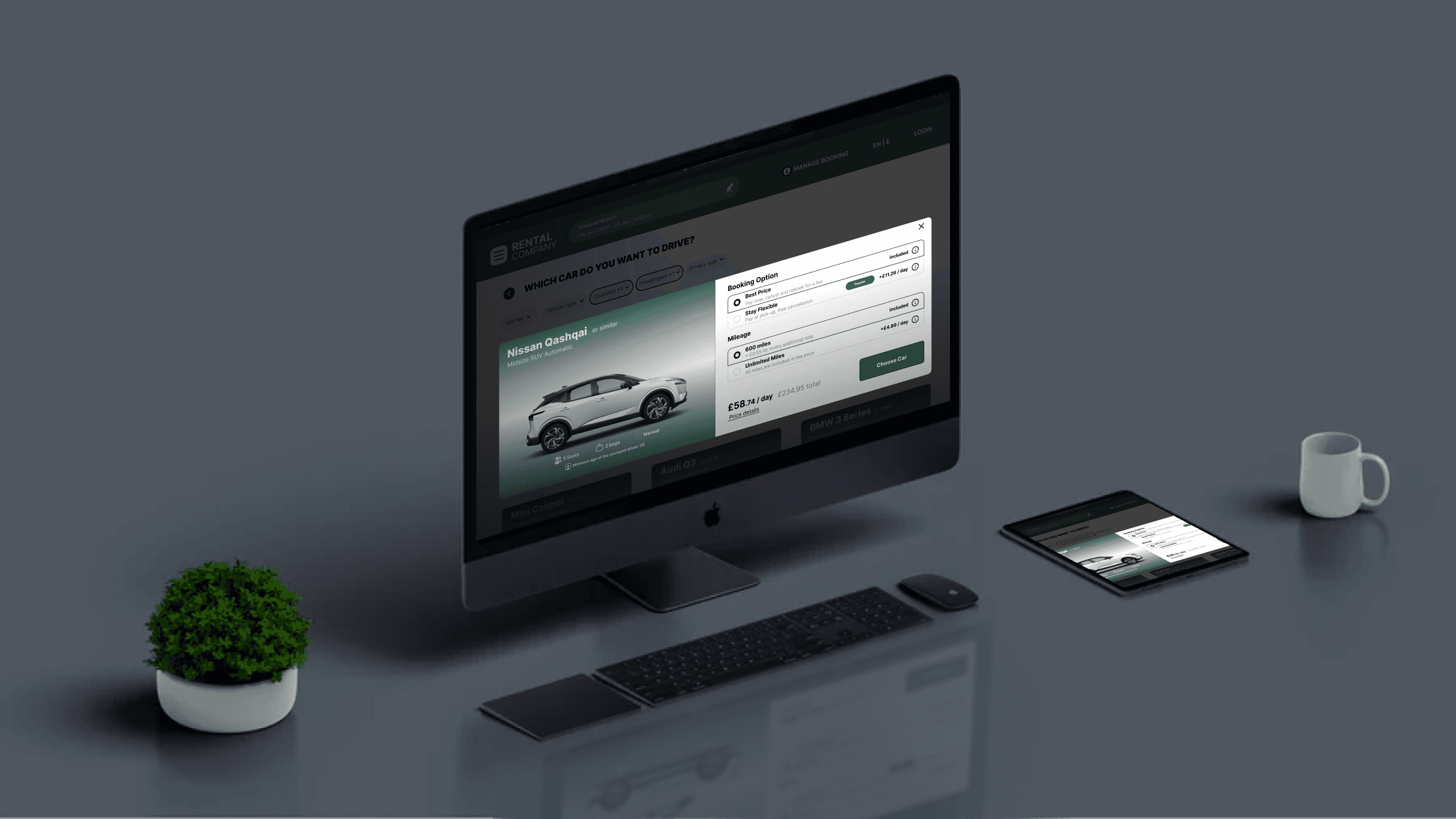
The high-fidelity desktop prototype was created to visualise the final user experience for the redesigned car rental website. This prototype aimed to replicate the real booking flow with pixel-perfect UI elements, consistent branding, and full interaction patterns, including hover states, form validation, and dynamic booking summaries.
Focus Areas in the High-Fidelity Design:
Clear, intuitive navigation across the booking process stages.
Transparent, step-by-step cost breakdowns visible throughout the journey.
Simplified insurance selection with visual explanations and upfront pricing.
Responsive desktop layouts ensuring optimal readability and usability.
Enhanced trust signals through secure payment indicators and reassuring microcopy.
Purpose: The high-fidelity prototype served as the blueprint for final stakeholder reviews and development handoff, ensuring design consistency, interaction clarity, and user-centred functionality before build-out.


Deliver
| Test the solution, validate it, and prepare it for real-world use.
In the Deliver phase, my focus was on refining the high-fidelity prototype to ensure it was development-ready, visually consistent, and aligned with user needs. This stage involved finalising UI components, documenting interactions, and preparing annotated Figma files for seamless handoff. The prototype was built to simulate a complete end-to-end booking journey, allowing stakeholders and developers to clearly understand how the experience should function in a real-world environment with the correct walk through method.
Designed in Figma


Customer Journey Mapping
I mapped the typical user journey from landing on the homepage to completing a vehicle booking on desktop, noting emotional highs and lows.
Pain Points Identified:
Poor filtering and overwhelming option displays during the Search Results stage cause confusion and decision fatigue.
A lack of clear, reassuring trust signals during the Payment and Rental Information entry stage leads to concerns about security and hidden fees.
Navigation through multiple steps without clear progress indicators creates frustration and uncertainty about how far users are from completing the booking.
Inconsistent information hierarchy and weak visual emphasis on critical pricing details make it harder for users to quickly understand total costs.
Outcome: The journey map clearly illustrated where user emotions dipped, helping prioritise design improvements.
Flow Diagram
I redesigned the core user flows to reduce friction during critical booking stages.
Key Changes Implemented:
Inline insurance explanations with icons and one-sentence summaries.
Sticky sidebar showing live booking totals throughout the process.
Checkout restructured into a simple, format.
User flow improve, to significantly improve journey through booking experience.
Outcome: The new flow diagrams aligned with user expectations for clarity, transparency, and ease of use on desktop.
Overview
Discover
Define
Develop
Deliver
Explore
My Projects
My works are a blend of innovative thinking and practical solutions,
ensuring they are both unique and effective.
Testing (Prototype)
I prepared and reviewed the high-fidelity prototype of the redesigned car rental booking journey. The focus was on validating the usability of the new desktop experience, ensuring the booking process was intuitive, the adds ons selection was clearer, and the overall flow encouraged user confidence through to completion.
Focus Areas:
Improved ease of navigation through the booking process.
Enhanced clarity around insurance options and additional services.
Smoother checkout experience with better visual guidance and cost transparency.
Outcome:
Feedback indicated that users found the redesigned journey clearer, more reassuring, and easier to complete compared to the original experience, reducing friction and improving overall satisfaction.
View Other Projects

Everybody Fitness - Gym App
View Project
Simplified Account Management
Reduced Cognitive Load for Bookings
Optimised Booking User Flow

Back to top
Overview
Discover
Define
Develop
Deliver
Overview
Discover
Define
Develop
Deliver
Overview
Discover
Define
Develop
Deliver
Overview
Discover
Define
Develop
Deliver