

Services
App and Branding Design
Category
Fitness App
Client
Fitness Club and Leisure Centre
Overview
Discover
| Understanding the people and the problem.
The Discover phase focused on identifying the real needs of gym-goers and understanding how users currently interact with fitness and leisure apps. My goal was to uncover user behaviours, frustrations, and expectations to inform our design direction.
Competitive Benchmarking
Competitive benchmarking involved analysing leading gym and fitness apps to assess their strengths, weaknesses, and usability patterns. This allowed me to identify best practices and opportunities to innovate.
Key Insights:
Most apps offer class booking but few integrate real-time gym floor availability.
Clear navigation and quick access to favourites (classes or instructors) improves retention.
Apps like PureGym and ClassPass score high on intuitive user journeys but lack personalisation.
Membership management is often buried or non-transparent.
Few apps integrate push notifications effectively for booking reminders.
Outcome:
These findings guided our feature prioritisation, focusing on a seamless booking experience, clear membership controls, and real-time gym slot visibility.
Online Surveys
I distributed surveys to active gym-goers and leisure centre users to gather insights into their behaviours, needs, and pain points.
Key Findings:
58% users value a quick booking process over design aesthetics.
63% found managing their membership online confusing or incomplete.
52% wanted visibility of quiet vs busy gym times.
Only 12% used fitness apps for more than booking – users stick to core needs.
Respondents preferred app reminders 1–2 hours before a booked session.
Outcome:
User input validated my focus on functionality and clarity. It informed my decision to prioritise ease-of-use over expansive features, especially in early iterations.
Usability Testing
We tested early design mockups with target users in moderated sessions to evaluate navigation flow and content understanding.
Top Usability Issues Identified:
Users struggled to locate the membership pause/cancel feature.
Confusion between booking a class and booking a gym slot.
Calendar view was too cluttered for mobile screens.
Lack of feedback when a booking was successful.
Outcome:
We introduced clearer labelling, separated gym vs class booking flows, implemented confirmation feedback, and redesigned the mobile calendar for scannability.
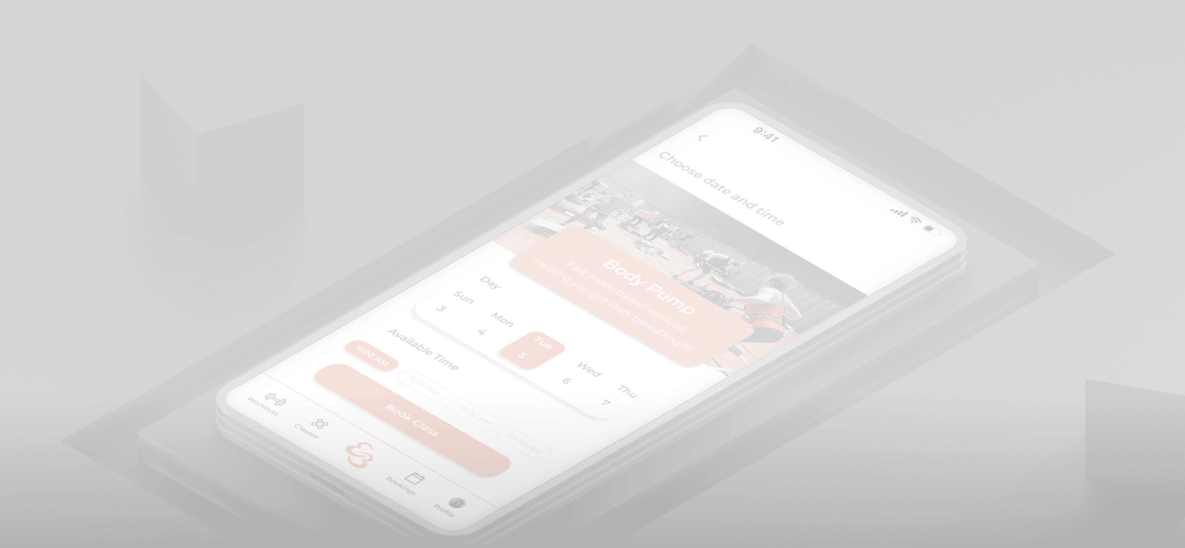
Everybody Fitness
Gym / Leisure Centre App
"A UX case study focused on streamlining online vehicle bookings and improving checkout clarity."
Define
| Making sense of the insights.
The Define stage involved synthesising our research into structured insights to clearly articulate user needs and product goals.
Develop
| Bringing ideas to life.
In the Develop stage, we moved from concepts to tangible design iterations through ideation, sketching, and prototyping. This phase allowed us to test and validate ideas quickly before investing in high-fidelity design. It also fostered collaboration across the team, ensuring that user needs remained central as we explored multiple creative directions.
Affinity Diagrams / Card Sorting
I grouped research observations and quotes into categories to identify user patterns and recurring themes.
Key Themes:
Frustration with complex or hidden settings.
Need for flexibility and control over bookings.
Demand for clarity in availability and pricing.
A strong preference for “favourites” and personalisation.
Notifications seen as helpful – but only when smartly timed.
Outcome:
Affinity diagrams helped me distil these themes into clear user goals and actionable problem statements, which informed our UX strategy.
Design Sketching
I explored a range of design directions with low-fidelity sketches to test layout ideas, navigation structure, and UI concepts.
Ideas Explored:
Bottom nav bar vs hamburger menu.
Calendar vs list view for bookings.
Toggle between gym and class schedules.
Badge indicators for peak vs off-peak hours.
Progress trackers for session usage.
Sketching allowed me to rapidly test and discard ideas, choosing only the most user-friendly patterns for digital prototyping.
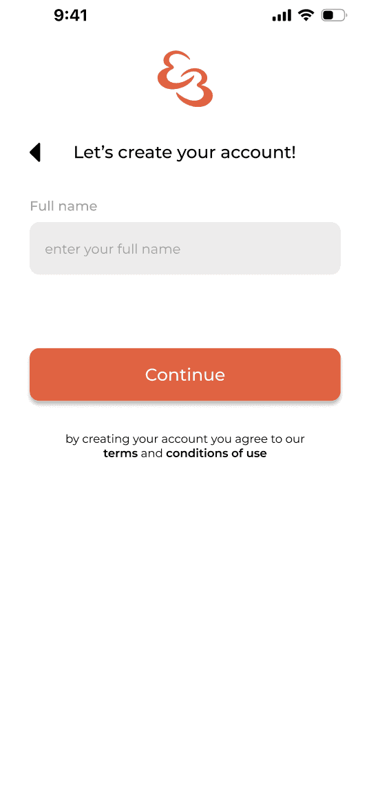
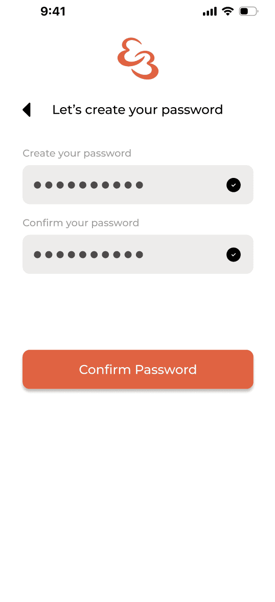
Wire-framing, Prototyping and UI Design
I created mid-fidelity wireframes to validate layout and flow, followed by interactive prototypes. Final UI design aligned with the leisure centre's brand, focusing on accessibility and clarity.
Details:
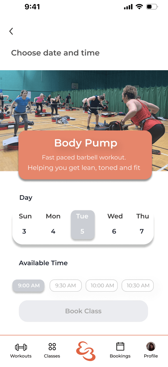
Colour-coded availability indicators.
Clear CTA buttons for each primary action.
Card-based class layout for easy scanning.
User profile with editable preferences and favourites.
I developed a fully interactive, branded prototype reflecting real content and flows for testing and stakeholder feedback.
Focus Areas in the High-Fidelity Design:
Real-time gym availability screen.
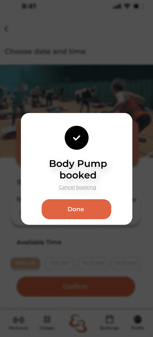
Booking confirmation and reminders.
"My Bookings" and history screens.
Full membership dashboard.
These assets allowed me to conduct final user testing, present to stakeholders, and hand off to developers with clear interaction logic.
Deliver
| Launching with confidence.
The Deliver phase involved final testing, validation, and preparing hand-off documentation for development. This ensured that all user journeys were refined, functional, and aligned with stakeholder expectations. I also created detailed design specifications and interaction notes to support a smooth transition from design to development. Additionally, this phase included accessibility checks and final tweaks based on usability feedback to ensure an inclusive, user-friendly experience.
Designed in Figma
Overview
Discover
Define
Develop
Deliver


Customer Journey Mapping
We mapped the full experience of a user from deciding to attend the gym through booking, attending, and managing their membership.
Pain Points Identified:
Uncertainty around peak hours and space availability.
Forgetting to cancel bookings, incurring penalties.
Difficulty rebooking regular classes.
Confusion over multiple membership tiers.
Outcome:
The journey map clarified where I could support users better with proactive features like smart reminders, favourites, and simplified cancellation flows.
Flow Diagram
I mapped user flows to visualise interactions within the app and identify areas for simplification or improvement.
Key Changes Implemented:
Streamlined booking into a simple 3-tap process when sign up.
Clearly separated booking flows for classes vs gym slots.
Added a “My Activity” section for previous and upcoming bookings.
Membership management centralised under one tab.
Outcome:
The updated flows reduced cognitive load and supported quicker task completion, aligning with user preferences for efficiency.
Overview
Discover
Define
Develop
Deliver
Explore
My Projects
My works are a blend of innovative thinking and practical solutions,
ensuring they are both unique and effective.
Testing (Prototype)
I performed final usability testing with the high-fidelity prototype to confirm all major issues were resolved and verify feature usefulness.
Focus Areas:
Booking flow clarity.
Notification timing and relevance.
Membership controls.
Navigation across key sections.
Outcome:
All users completed tasks successfully within 2–3 minutes. I received positive feedback on ease-of-use and clarity. Minor tweaks were made to button placements and label wording before final delivery.
Overview
Discover
Define
Develop
Deliver
Overview
Discover
Define
Develop
Deliver
Overview
Discover
Define
Develop
Deliver
Back to top

SwiftDrive - Car Rental
With user-centered approach, the goal was to create an intuitive interface for effortless car rental management while incorporating functional, aesthetic an experience design.
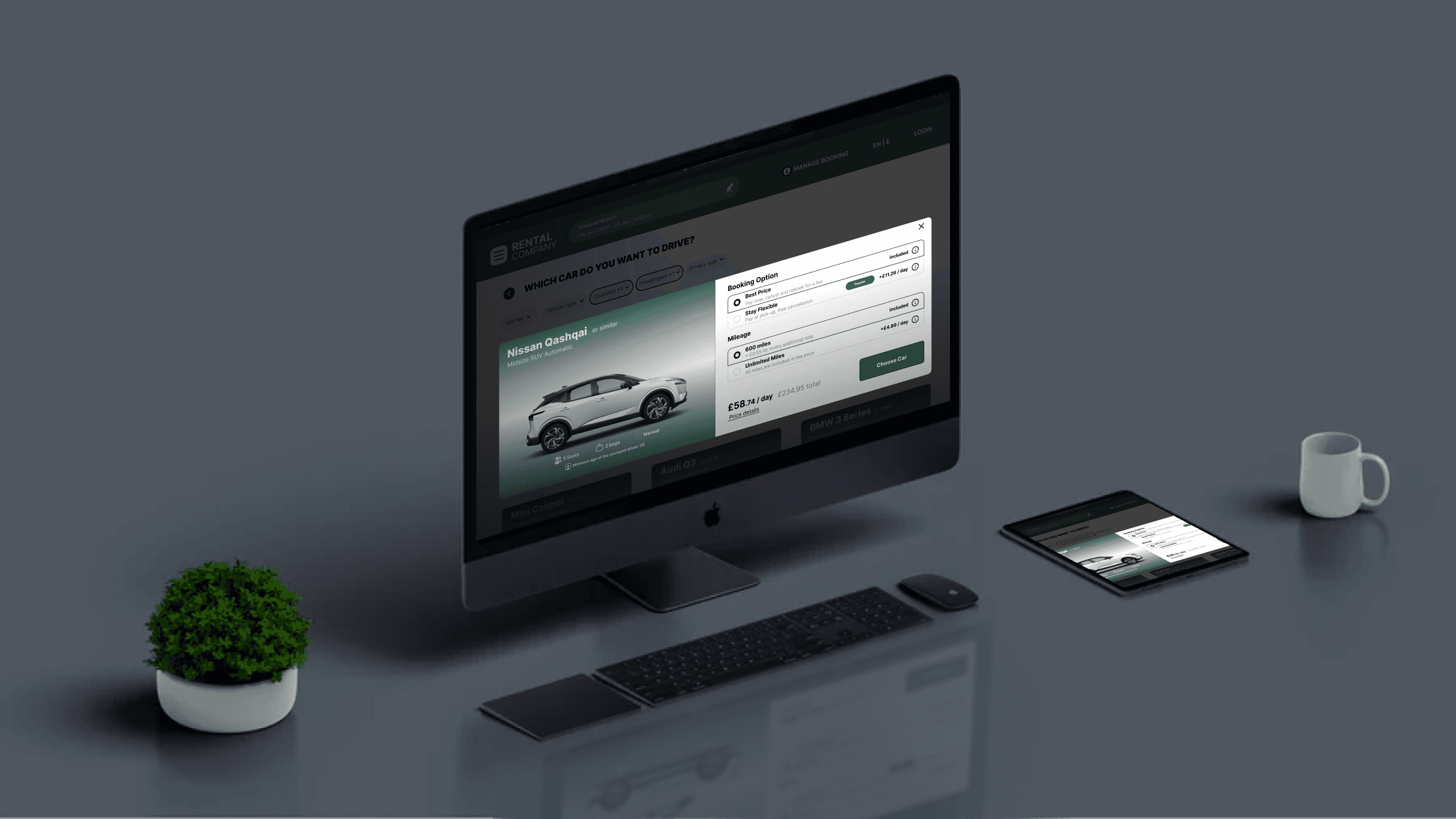
Seamless Booking Flow
Intuitive Navigation
Optimised Desktop Interface

View Project